Print screens of double page spread
View more presentations from melissaedwards123.
 |
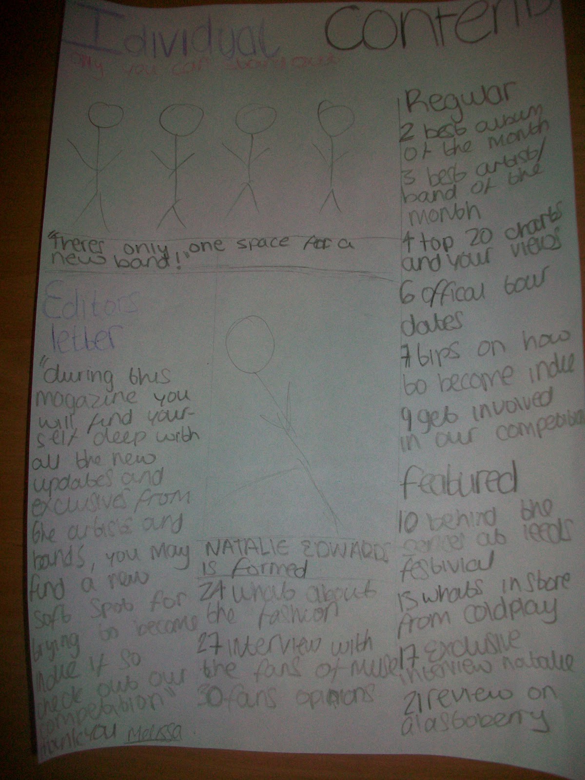
| This is a sketch that I am hoping by double page spread should look like. I am going of this sketch for my structure and ideas. |
 |
| I have used this image for my double page spread has its a live preformance and it shows toms full face and him singing. i have cropped the sides upto were it says' picket liverpool'. |
 |
| I have also used this for my contents page as it shows a live preformance of the 'Upper-Hand'. |
 |
| I have used this for my contents page as it shows her true personalilty about singing. It suggests that she'll give up if she doesnt succeed which will make her work hard. |
 |
| This is my front cover image, i used this because she s very serious. for my front cover i have cropped the top white wall off and cropped abit of her elbow so that it was more zoomed in. |
 |
| I have used this image for my contents page to show the 'artillary' in a live preformance. i have cropped out the base player as there uis an aduiences head in the way and kept the dummer in the back ground, however i have cropped abit of the top bit off. |
 |
| This image would of be good if she was more serious and wasnt to soft |
 |
| I like this image however with her holding the microphone like this it suggests that she is feed up of singing. |
 |
| I really like this for my front cover as she is serious. |
 |
| This images doesnt suggest serious, it implys that she is happy and enjoyful |
 |
| I would like to use this image for my contents page as it shows her real personality and how she feels about music |
 |
| I like this image as it shows that she is hiding from the light suggesting her fans |
 |
| This image would be good for the contents page as it show the upperhand preforming, however the shot isnt good as it shows the speaker at the front. |
 |
| This image is to blury, i would need to do a redo of this shot as it is a good angle to get the whole band in |
 |
| This image would be good for the double page spread however it is covering his face. |
 |
| I would like to use this for my double page spread as it shows an action shot of the singer and has the drummer in the background |
 |
| This image would be good for my contents page if I cropped out the left side. |
 |
| This image is good of the whole band however all the audience is in the image. |
 |
| This would be a good image for the contents as it shows an action shot and shows the singers full body. |
 |
| Add caption |
 |
| i like the lighting on this picture. However I prefer to have it portrait for the front cover. This could be used on my contents page. |
 |
| The lighting is very good on this as its bright, however I need to cut of the wood at the top. |
 |
| I like the way it is awkward however the baxkground isnt good as there are things on the wall. |
 |
| I like the way there is a shawdow in the background which suggests theres another person waiting to come out. |
 |
| I like the way there is a shadow in this one aswell and i like the midshot for my front cover. |
 |
| I like this shot however i would prefer it to have been a midshot. |
 |
| I like this shot for my contents page. |
 |
| This shot could of been better if her hands were placed on her hips to show an edge. |
 |
| I really like this image however it is not good enough for the front cover because of the colours and its the wrong mise on sence. |
 |
| I may use this image in my conents page as an option, as the colours wont match the front cover. |
 |
| This shot would be good for the front cover as she looks serious and the mise on sence works well as its plain. Also it is direct address which relates back to my questionnaire. |
 |
| This image would be good as the backround is clear which shows she is an individual which relates to the masthead. |
 |
| This shot could of been better if it was a midshot and if the lighting was better. |
 |
| This shot could of been better if it showed both of her arms and hands. |
 |
| I like this shot as it suggests she ready and incharge which relates to being an individual. |
 |
| The same with this shot she likes confident and ready to show her music. |